Case Study – GYEDC.
Brand Foundation Refresh for Enterprise Site Selectors and Investors
GYEDC is in the business of attracting serious opportunity to Yuma County, and that means their brand has to feel as credible as the conversations they are leading.
During a leadership transition, their messaging and visuals were not always landing with one consistent voice. The logo no longer felt in line with their modern image, and they felt boxed in due to its lack of flexibility.
They also needed to step forward as GYEDC for a more unifed and inclusive identity, while still protecting the trust and equity attached to their full name that they had already earned.
We built a modern brand foundation that made their story easier to tell and trust, whether the audience is local partners or enterprise decision-makers.
The Moment It Clicked
Together we realized it was about more than fixing up the old logo.
When we sat down to map how GYEDC needed to show up going forward, the gap was clear: they had strong momentum, but the brand elements were not speaking the same language when they weren’t there to represent them. Consistency was the key.
What We Protected
- The legacy and trust GYEDC had already built in the region
- Credibility with enterprise companies, investors, and site selectors
- Existing equity in the name and reputation, even while shifting toward “GYEDC” in daily use
Approach
Building on a solid foundation of trust:
- Align the direction so the brand reflects the future without breaking what already works
- Build the logo system for real-world usage across formats and vendors
- Lock in the foundation with a comprehensive brand guide, voice, and visual toolkit
- Deploy confidently through collateral and environmental applications
Deliverables
The brand needed to work for them. They needed a foundation that could hold up across every platform and every audience, with direction clear enough that the brand stays consistent no matter who was presenting it or where.
Executive Summary
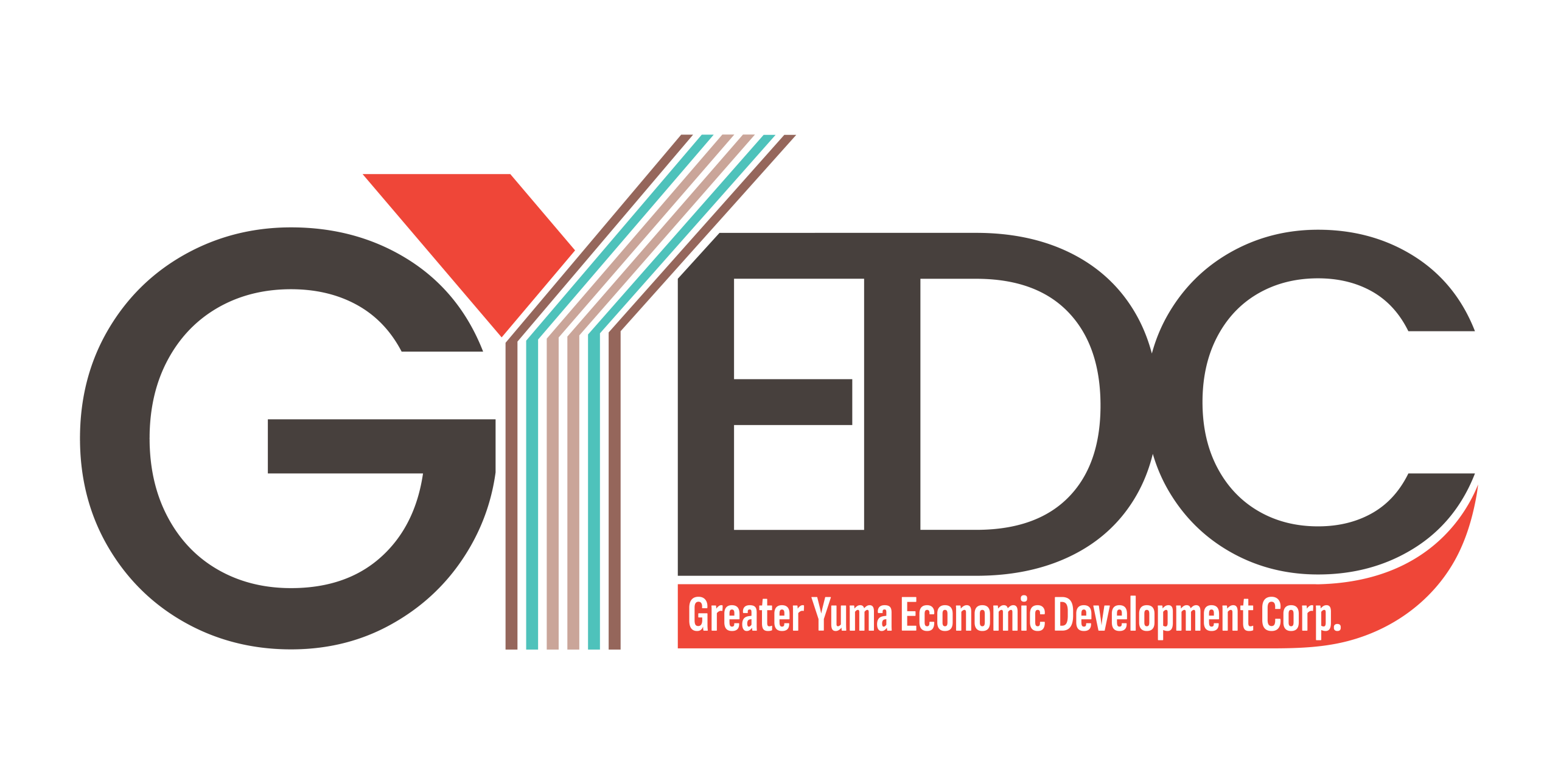
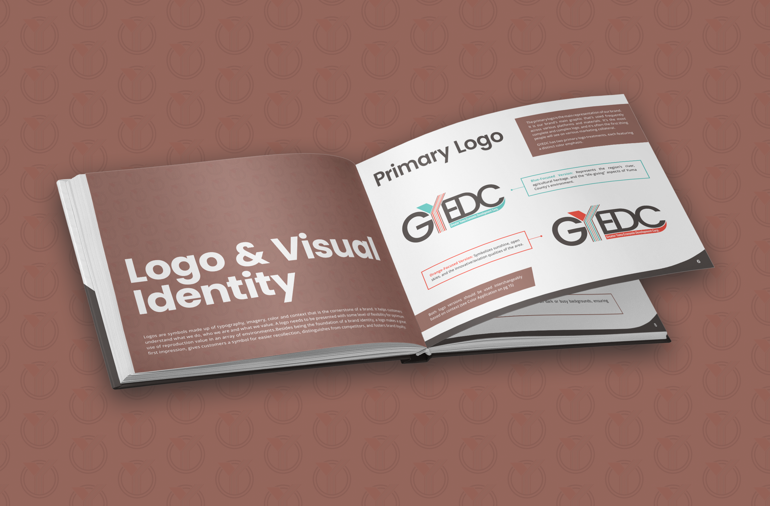
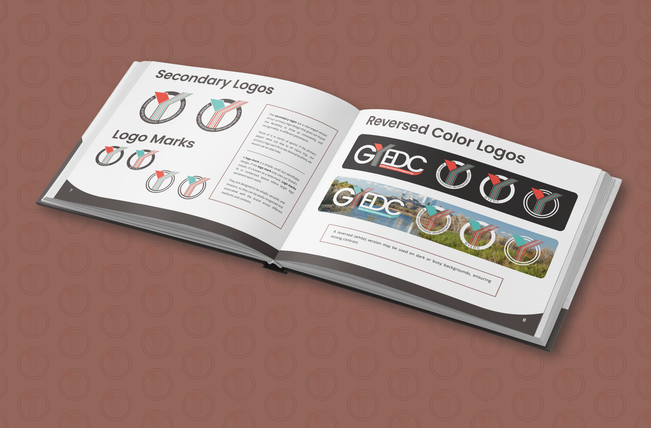
- Complete logo system: primary, alternate, mark, one-color, white version, file formats, usage guidance
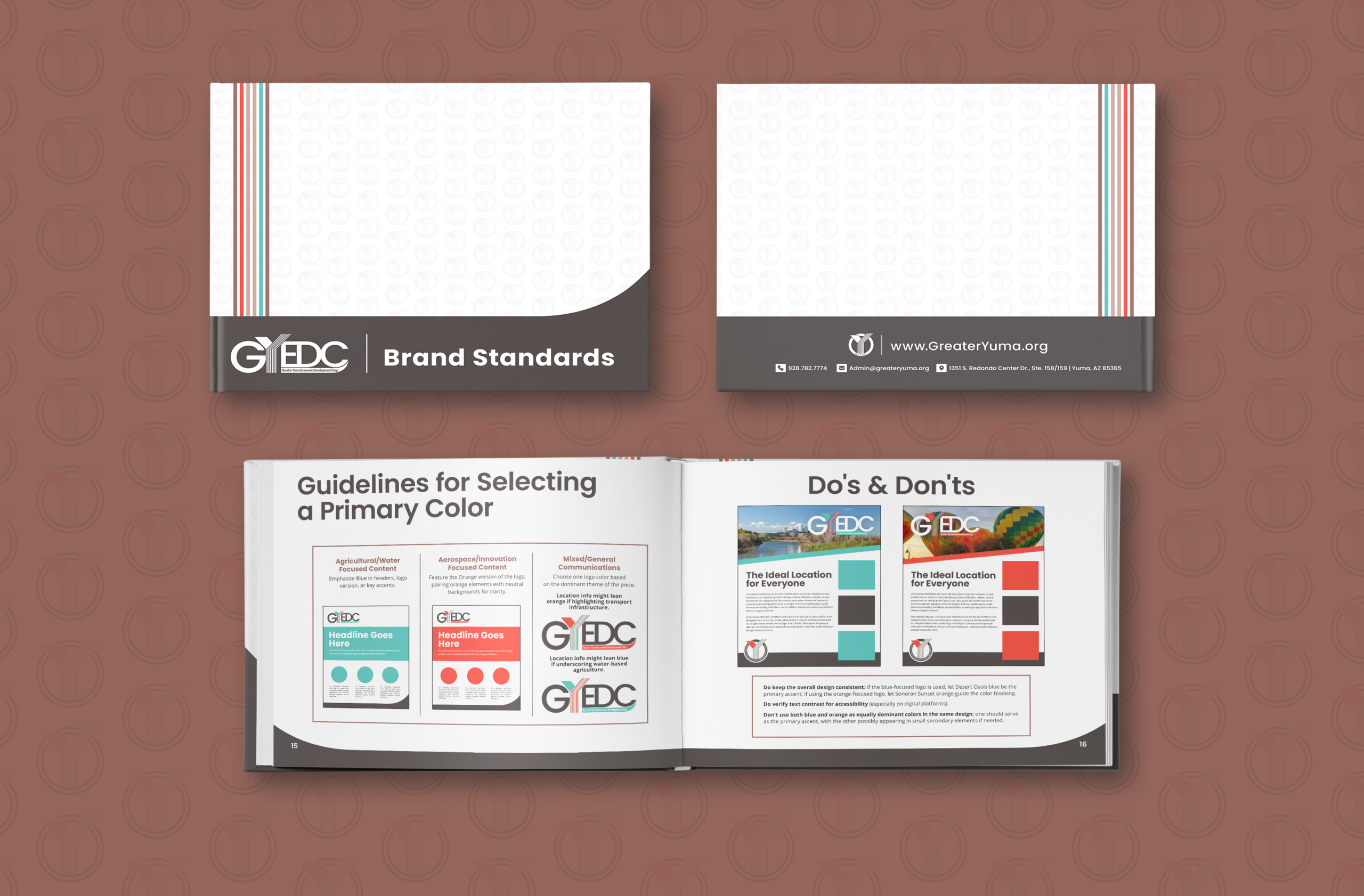
- 56-page Brand Guide (print and PDF)
- Brand voice and messaging direction
- Typography guidelines
- Co-branding guidelines
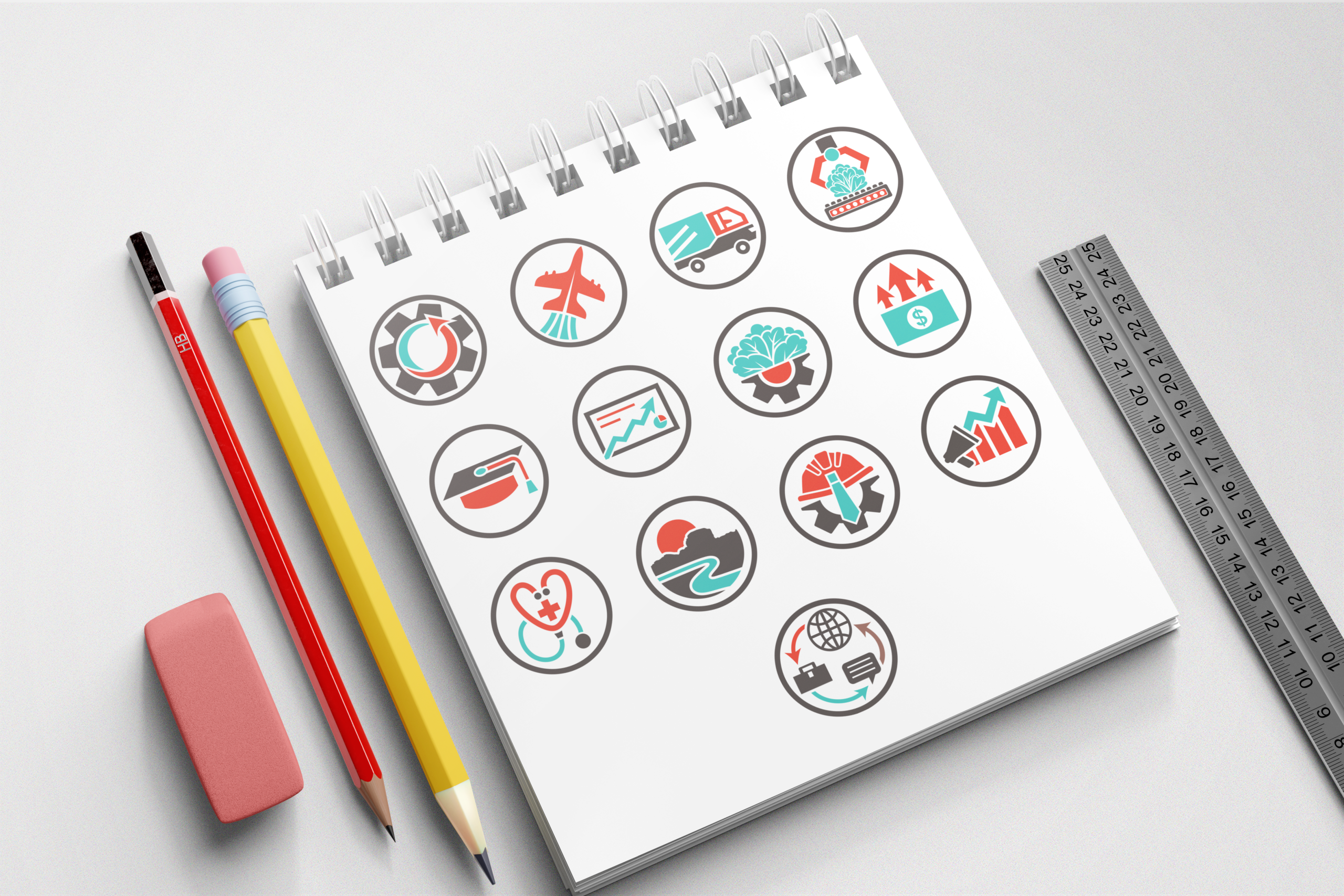
- Custom industry icon set (13 icons)
- Color palette and application guidance
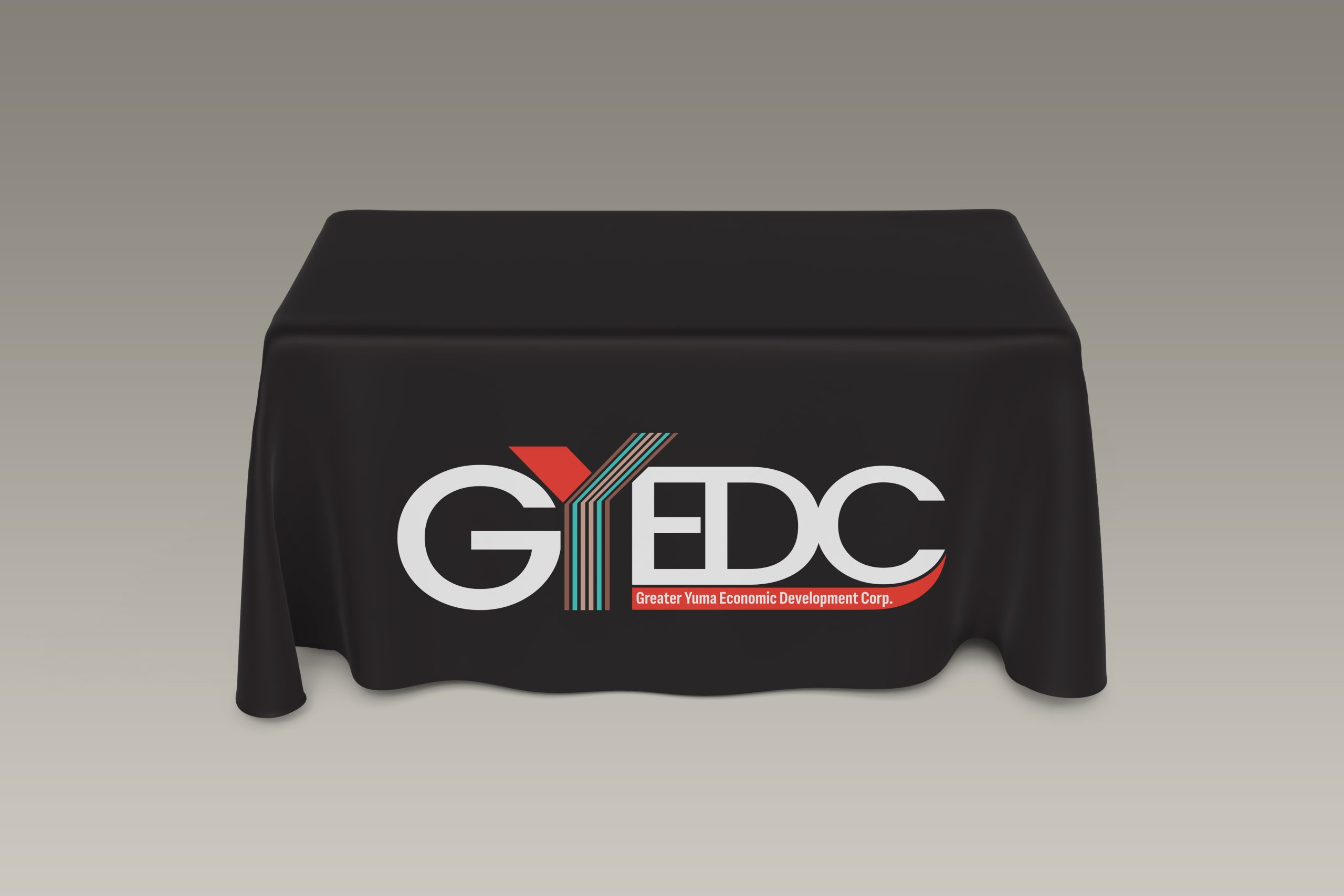
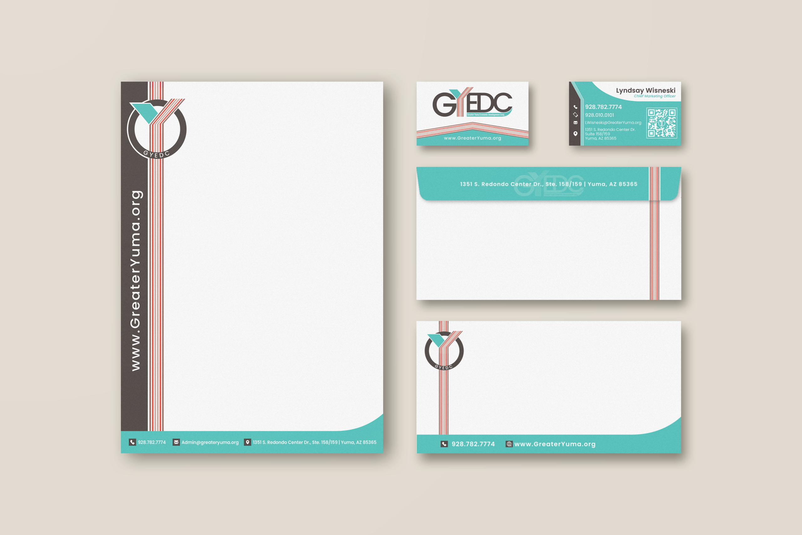
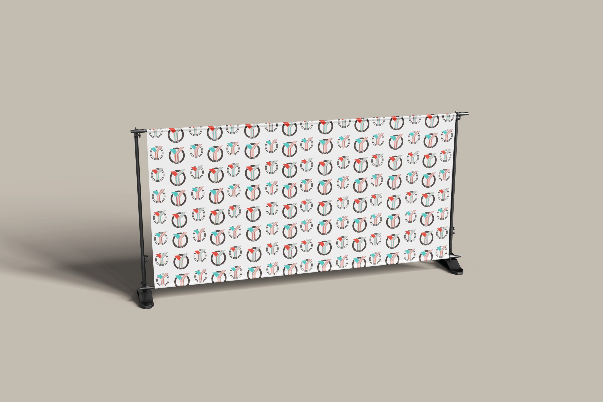
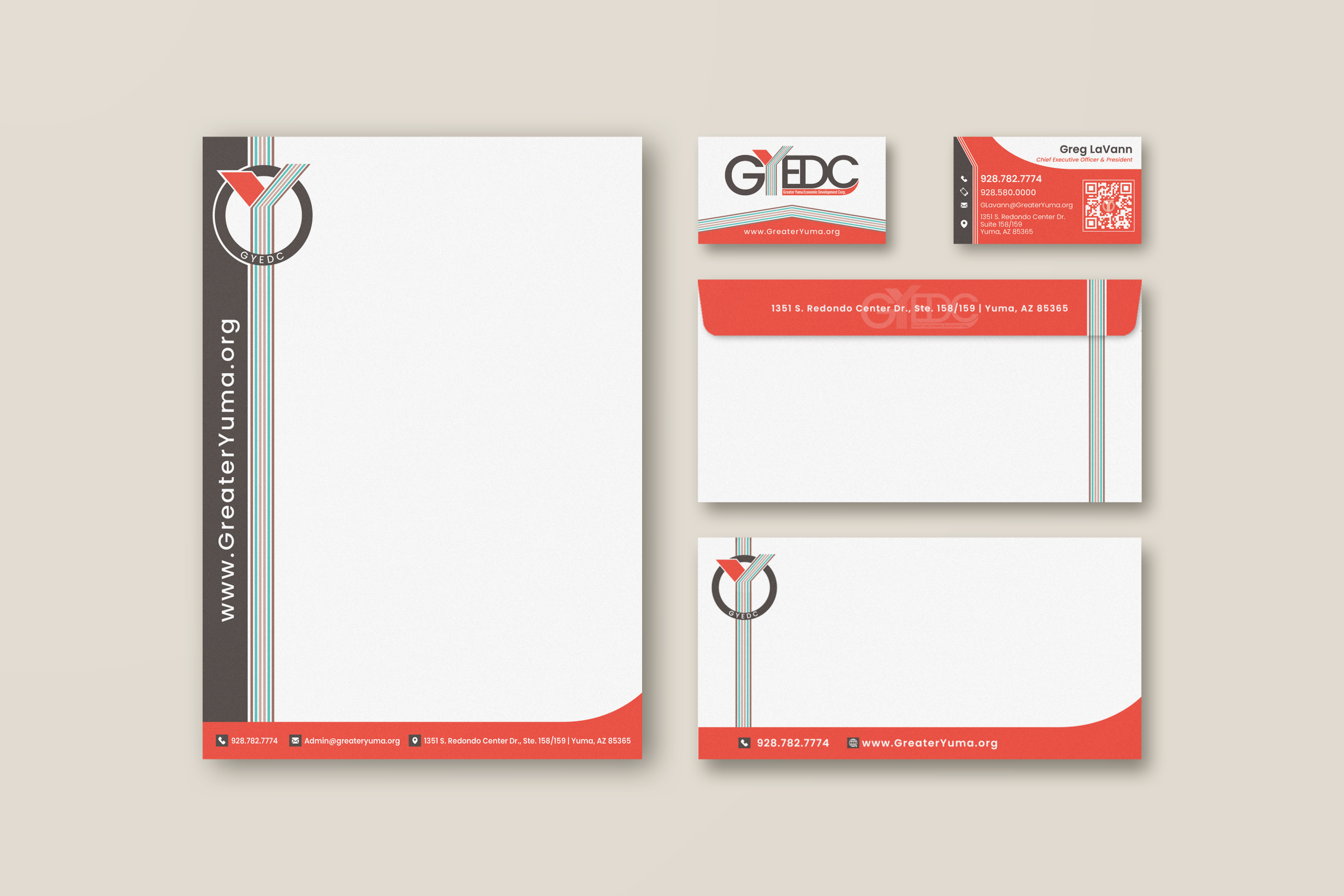
- Rollout collateral: business cards, stationery, thank you card, name badges, step-and-repeat, tablecloth, and additional supporting materials (roughly a dozen total)
Constraints We Worked Within
- Preserve legacy colors while expanding into a palette that reflects the community
- Keep a clear emphasis on the “Y” and regional identity
- Ensure the logo works everywhere, from small print to large environmental pieces
- Board approval process and stakeholder alignment
Results in Two Lanes
Business Outcome
- Stronger storytelling and a clearer public presence
- Higher perceived value and credibility in communications
- Award-winning momentum in their broader communication efforts (including national awards for videos produced by others)
Practical Outcome
- Consistent look across touchpoints
- Cleaner rollout and easier adoption across the organization
- Team alignment, so future content does not drift off-brand
Before / After / And Beyond
Before: The brand felt blocky, dated, and more authoritative than approachable, with inconsistent messaging and visuals across assets.
After: A fluid, modern identity system built for credibility, clarity, and repeatability. Became a true cornerstone of their brand.
And Beyond: 56-page brand guide, 13 custom icons, a full suite of updated materials, and direct client feedback that the work is actively supporting the organization’s goals.
Client Feedback
“Collaborating with imaginary friends over the past year has been truly rewarding experience. Their team brought incredible creativity, strategy, and attention to detail to every phase of the project. They developed a refreshed logo, updated collateral, and a comprehensive 50-page brand guide that has elevated our organization’s voice and presence across all platforms. A strong brand is more than just visuals; it’s the foundation of how a company communicates its purpose, builds trust, and inspires action. Jon and his team understood that from day one. They walked us through every detail of the process helping us clarify our vision and ensure that each element, from color choice and typography to messaging and iconography, aligned with our goals and values. The result is a brand identity that empowers us to speak with clarity, consistency, and purpose, whether we are engaging the local partners or global companies, this effort has already become a strategic tool in attracting new industries and reinforcing the greater Yuma region’s credibility as a hub for innovation and growth. We are also especially proud to have partnered with a local Yuma business on such a critical initiative. Imaginary Friends proves that world-class branding, marketing, and design talent exist right here in our region. There’s no need to look outside the area when excellence is already in our own backyard. We are so grateful for the partnership and incredibly proud of what they created. We are grateful for their partnership and incredibly proud of what they created.“– Lyndsay Wisneski , CMO at GYEDC
Ready to See What Your Brand Can Become?
You do not have to guess your way through marketing. Whether you are building from the ground up or refining what you already have, we will help you create a brand that feels right, works hard, and stands out for all the right reasons.