Case Study – Addie Packs.
Logo Refresh and Collateral System for a Brand that Leads with Heart
Addie Packs exists for a moment no family plans for. When a child needs an unexpected referral to Phoenix Children’s Hospital or another facility outside Yuma, everything gets heavy fast.
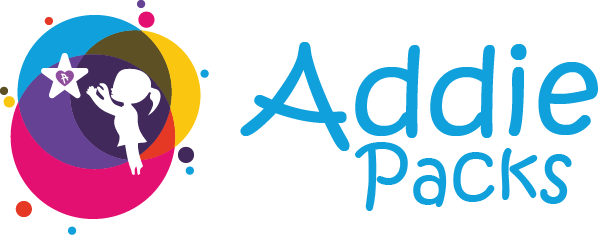
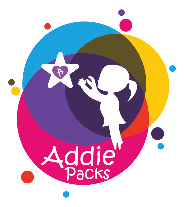
Their founder had a logo that carried real meaning. It was partially created by Addie herself, and it captured the heart of the mission. But it also did not scale across the tools the nonprofit needed to grow.
They were doing extraordinary work with a visual identity that was not fully carrying the weight of that work.
We refined the brand without erasing the origin story, then built a complete kit that helped Addie Packs show up with clarity, consistency, and trust.
The Moment It Clicked
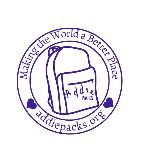
The breakthrough was realizing we could keep Addie’s presence in the mark while still building a professional system around it.
We preserved the handwritten “A” from Addie as a living piece of the identity, then shaped everything else to support it. That is how the brand stayed true and became usable everywhere.
What We Protected
- The spirit and purpose of the original idea
- The legacy of Addie and the meaning behind the handwritten elements
- The warmth of the mission, without letting the brand feel informal
- Trust, because donors and partners decide fast, sometimes before they ever meet you

Approach
Creating with respect:
- Honor what was already real and identify what needed refinement, not replacement
- Build a scalable logo system that works in every situation
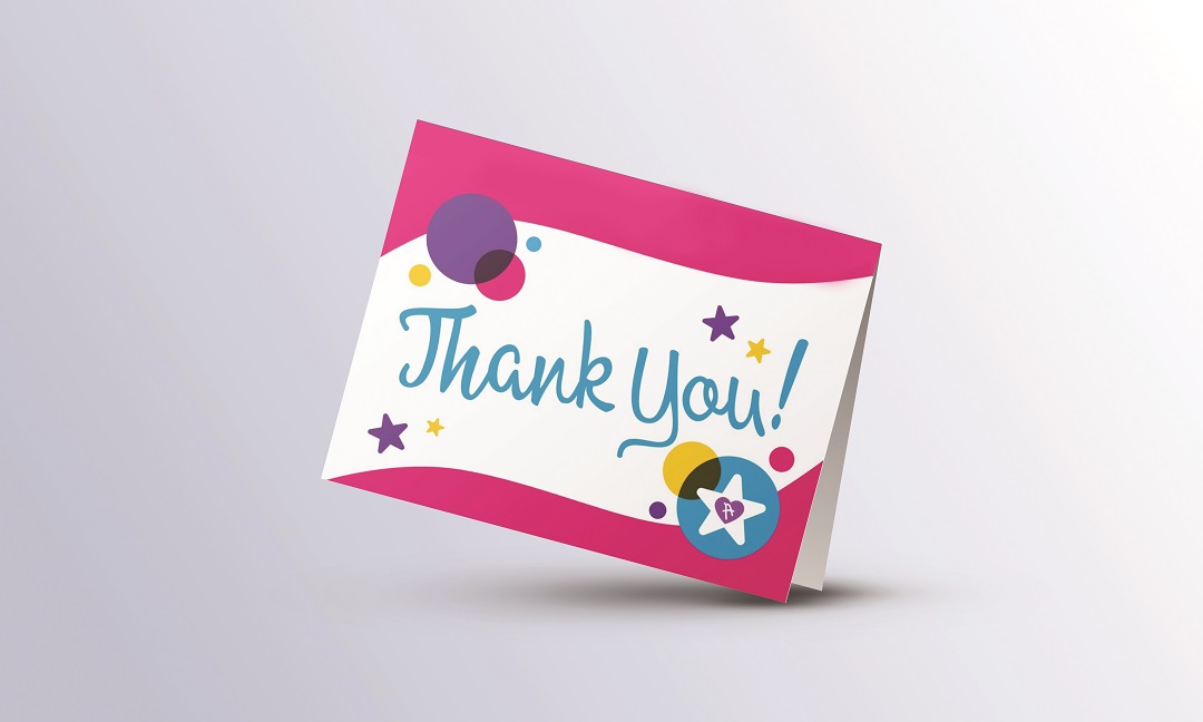
- Extend the identity into collateral that helps them communicate, fundraise, and show up consistently
- Make the brand easy to use so the organization can move faster
Deliverables
Beyond the logo, they needed a full identity that could support families in crisis and inspire the wider community to step in and help.
Executive Summary
- Logo refresh and full logo kit build out (primary, alternates, mark, one-color, white version, file formats, usage guidance)
- Color palette and design elements
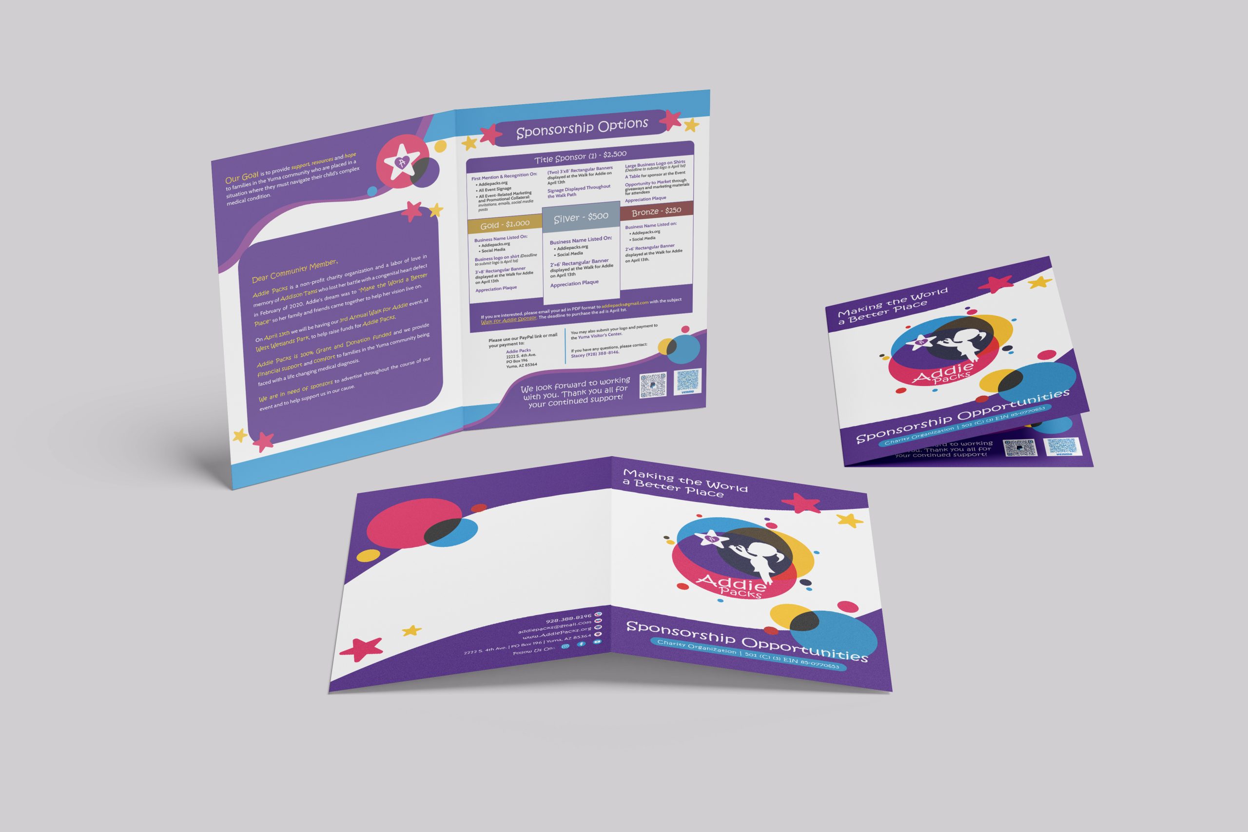
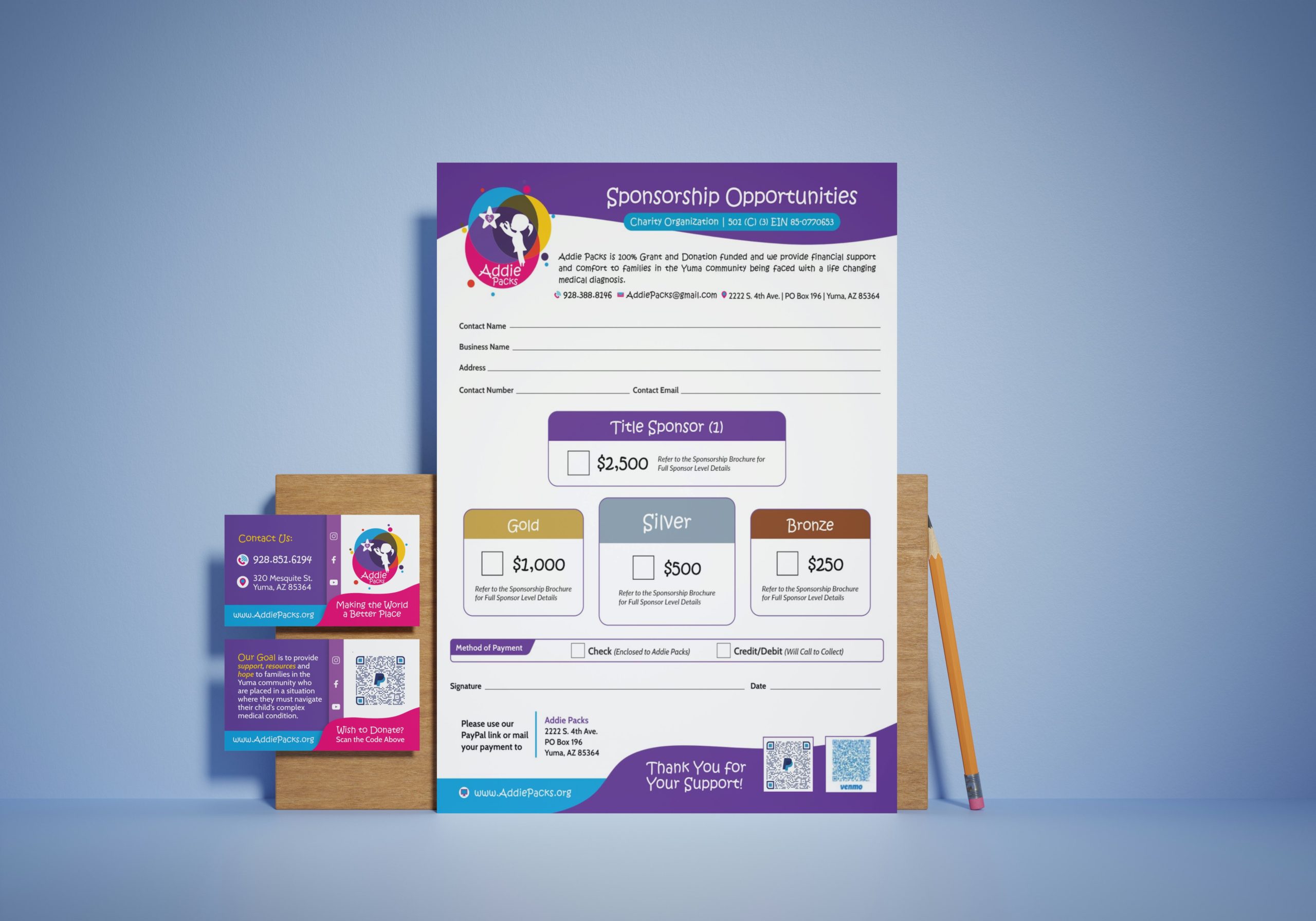
- Brochure
- Sponsor form and sponsor brochure
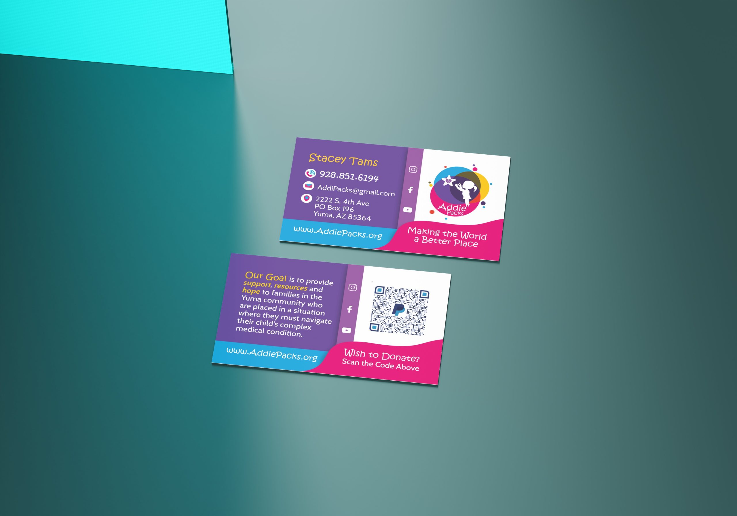
- Business card and stationery
- Contact card for story requests
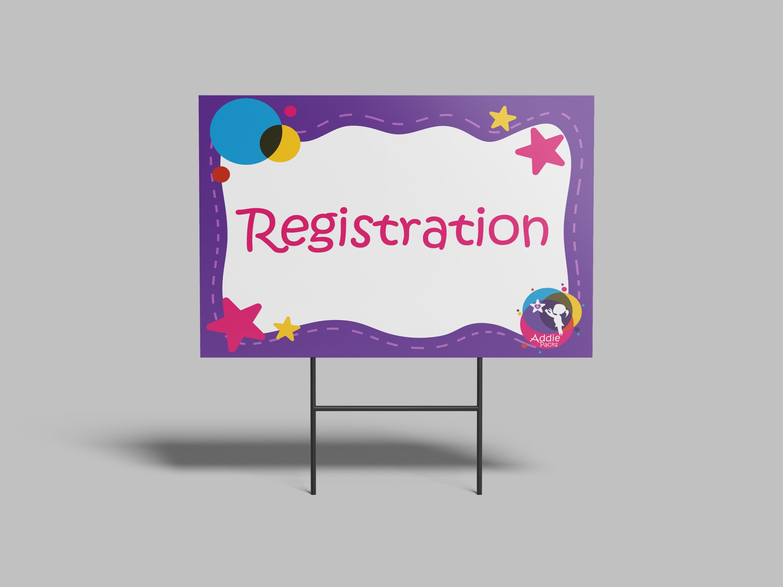
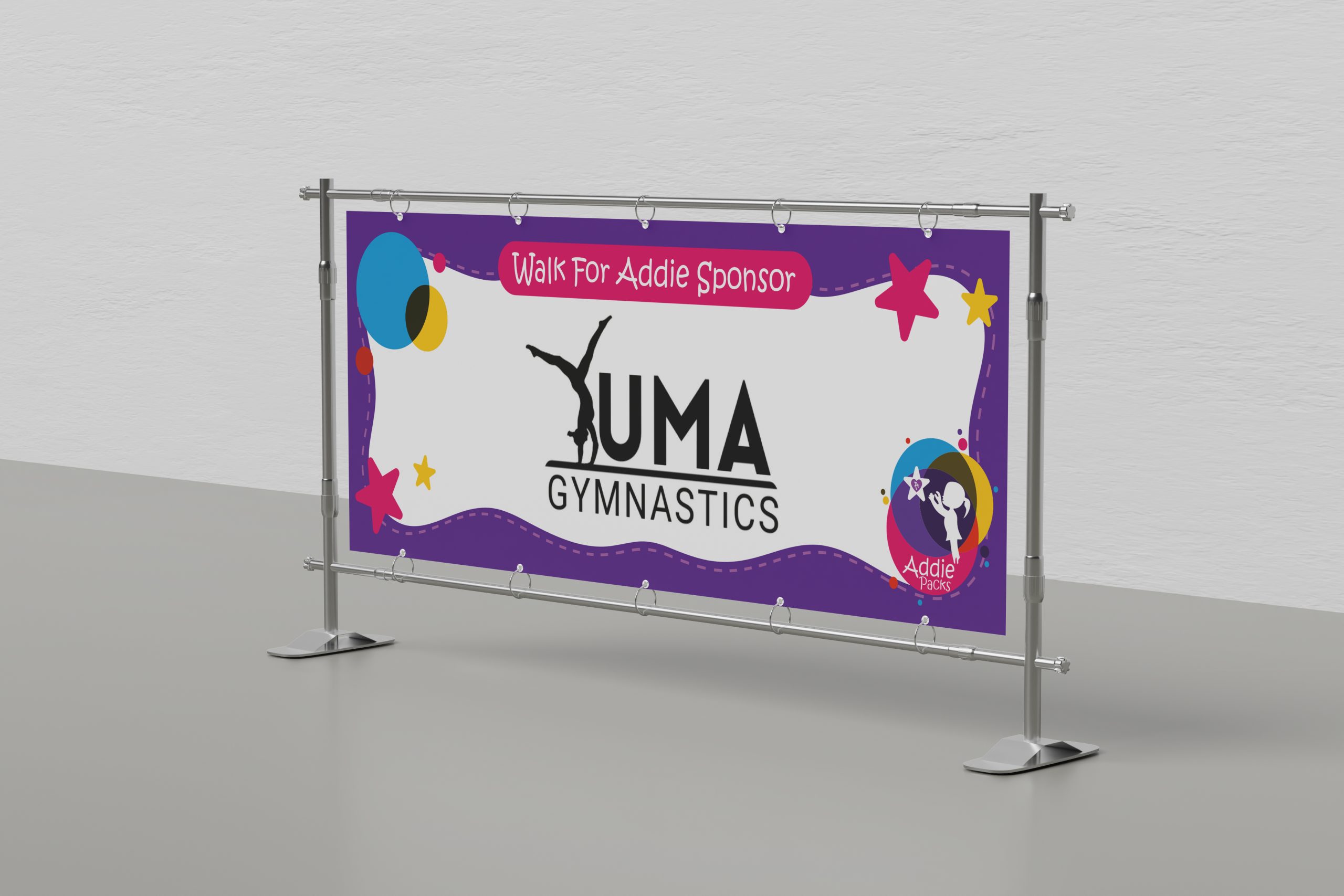
- Event banner assets
The Problem We Solved
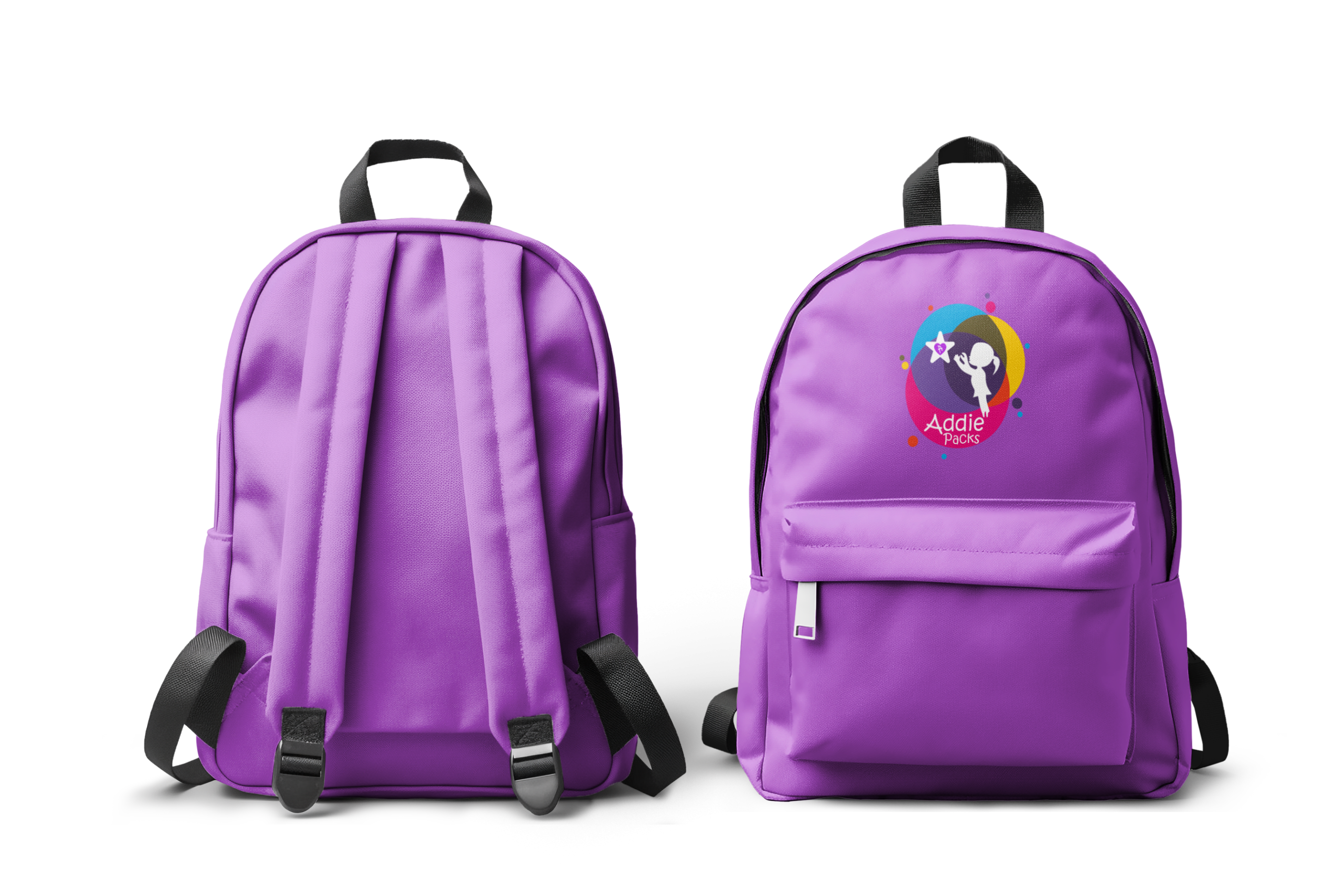
Before: The logo was heartfelt but couldn’t fufill the flexibility needed for growth. It did not work cleanly across different formats, often leading to inconsistent recreation or illegibility.
After: A brand identity that still feels like Addie and can represent the nonprofit in all settings. A complete kit that scales across print, events, and outreach.
Results in Two Lanes
Business Outcome
- Elevated visibility and stronger trust signals in the community
- Increased confidence to step out, tell the story, and invite support
- A stronger platform for fundraising and events, including annual gala momentum
Practical Outcome
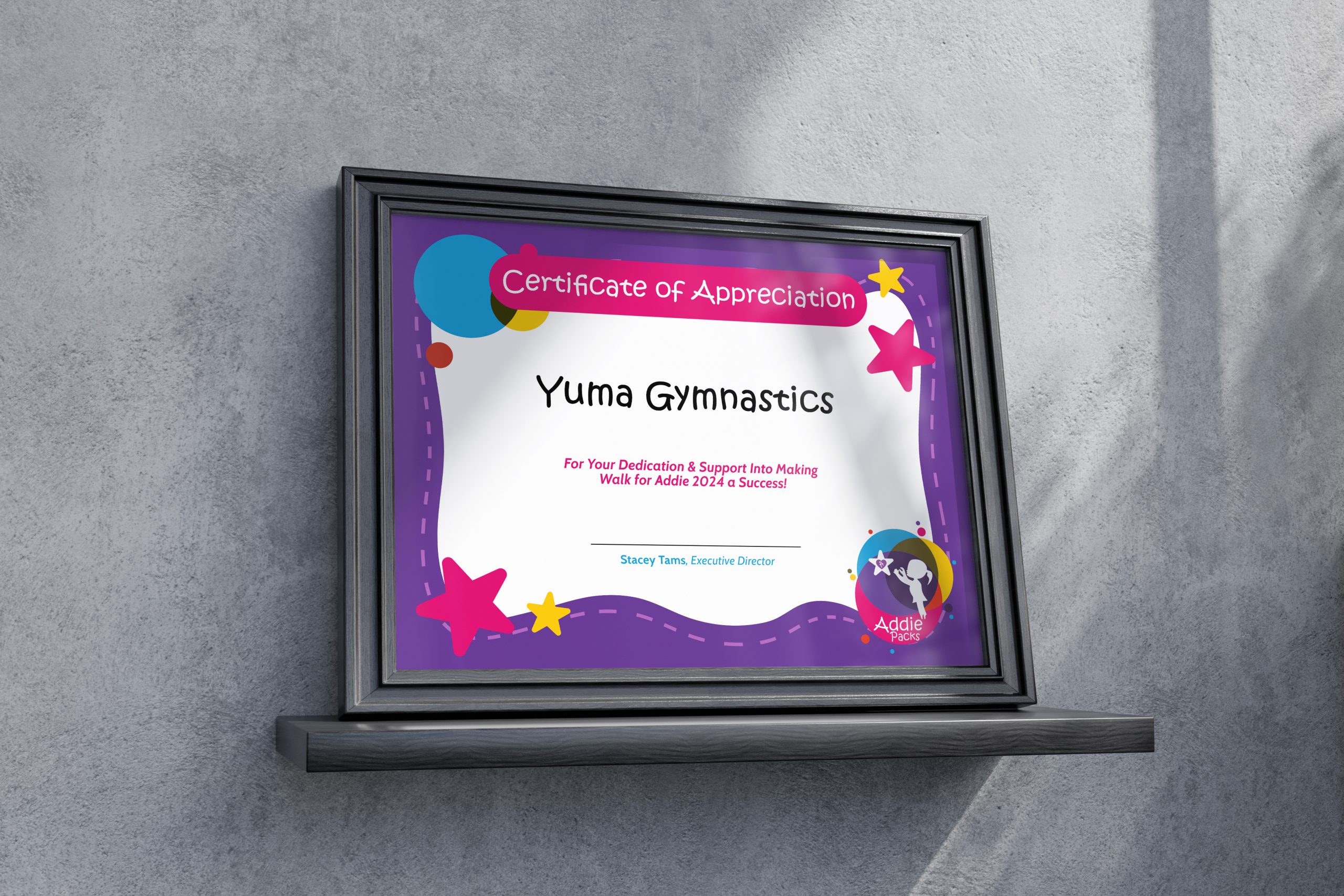
- A consistent look across brochures, sponsorship materials, and event presence
- Cleaner rollout for new materials without reinventing design every time
- Assets that vendors, volunteers, and partners can use correctly
Before / After / And Beyond
Before: Hard to scale. Difficult to recreate or rework while maintaining intention.
After: Hopeful and human, but built with structure and credibility. Flexible enough to be everywhere the mission needs to show up.
And Beyond: A complete collateral suite, a consistent visual presence across events and outreach, and direct client feedback tied to increased engagement and event attendance.
Client Feedback
Addie Packs recently had the opportunity to work with Imaginary Friends Design Studio through their New Year, New Yuma brand upgrade.
This opportunity has been transformative for Addie Packs. Their team took the time to deeply understand our mission of supporting families with critically ill children and turned that understanding into a refreshed identity that speaks to both our heart and our purpose.
The upgraded branding has elevated our visibility in the community, helping us connect with more supporters and families than ever before. The new logo, color palette, and design elements not only capture the essence of hope and resilience that we strive to embody but also resonate strongly with our audience.
From event materials to online campaigns, the cohesive and professional look Imaginary Friends created has instilled a new level of confidence in our outreach. Thanks to their expertise, we’ve seen increased engagement, higher attendance at our events, and a greater sense of trust from our partners and donors.
Imaginary Friends Design Studio didn’t just reimagine our brand; they empowered us to tell our story more effectively and make a bigger impact in the lives of those we serve. We are forever grateful for their creativity, professionalism, and dedication to our cause.– Stacey Tams, Founder
Ready to See What Your Brand Can Become?
You do not have to guess your way through marketing. Whether you are building from the ground up or refining what you already have, we will help you create a brand that feels right, works hard, and stands out for all the right reasons.